I think I know why you might be scared of colour
Throughout my training, I carried out a mountain of research about the history of interior design. And one thing I kept noticing was how colourful interiors were throughout history, as far back as the 15th Century.
So using colours in your interiors isn’t a new thing at all, but if you look at the interiors of last 20 years or so, there seems to be a huge lack of colour and people seem to have grown nervous to use it.
Well, I’ve been spurred on to carry out my own research to get to the bottom of it to see if I can help instil the confidence you need to start embracing colourful interiors again.
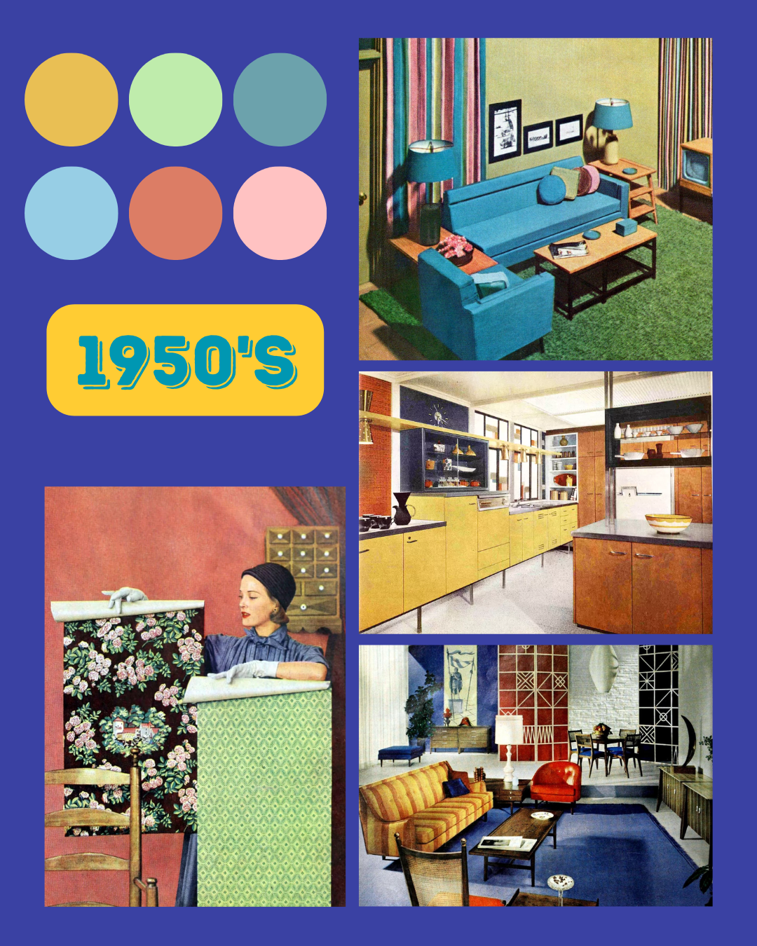
1950s
In the 1950s, the future was bright and so was the décor! Bright, joyful colours were used in every room of the house. Homes were individualised, and colours weren’t limited to walls or tiles, but applied to everything including bathroom suites and accessories. Baby blues and minty greens were common choices, but pink was the star of the show, especially in kitchens and bathrooms.
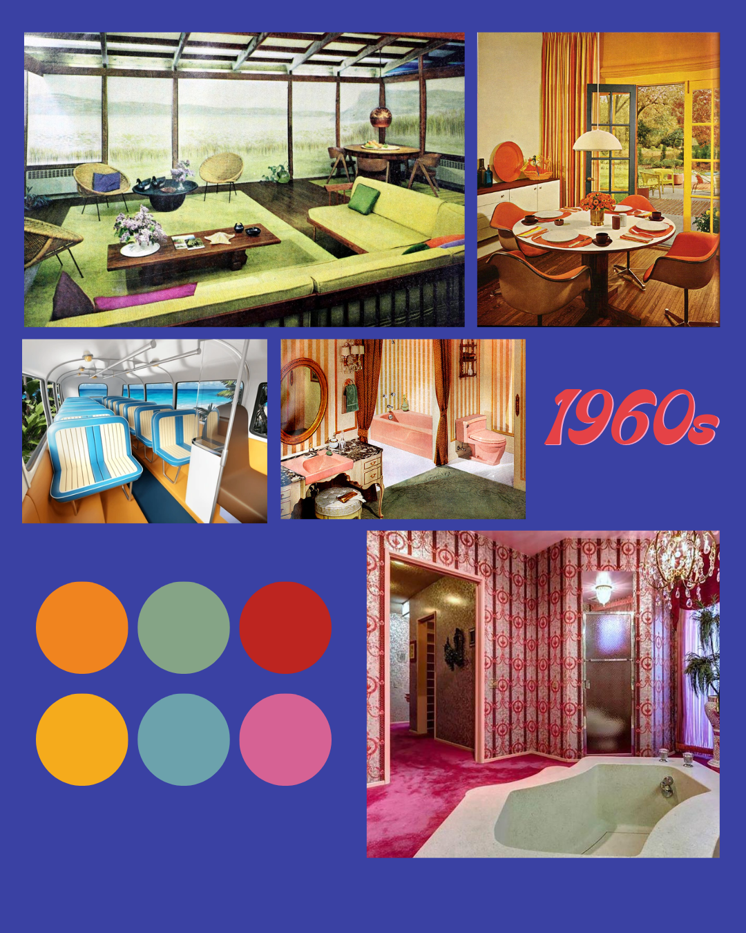
1960s
Personality was truly expressed in this decade and the 60s brought in outlandish colour pairings and patterns. The pastels were swapped out for a bolder palette and patterns such as florals, swirls and stripes were not just limited to clothing, but could be seen in carpets, curtains, and walls too. And as the fascination with the science grew, bonkers furniture and a brighter colour palette reflected the interest in space age.
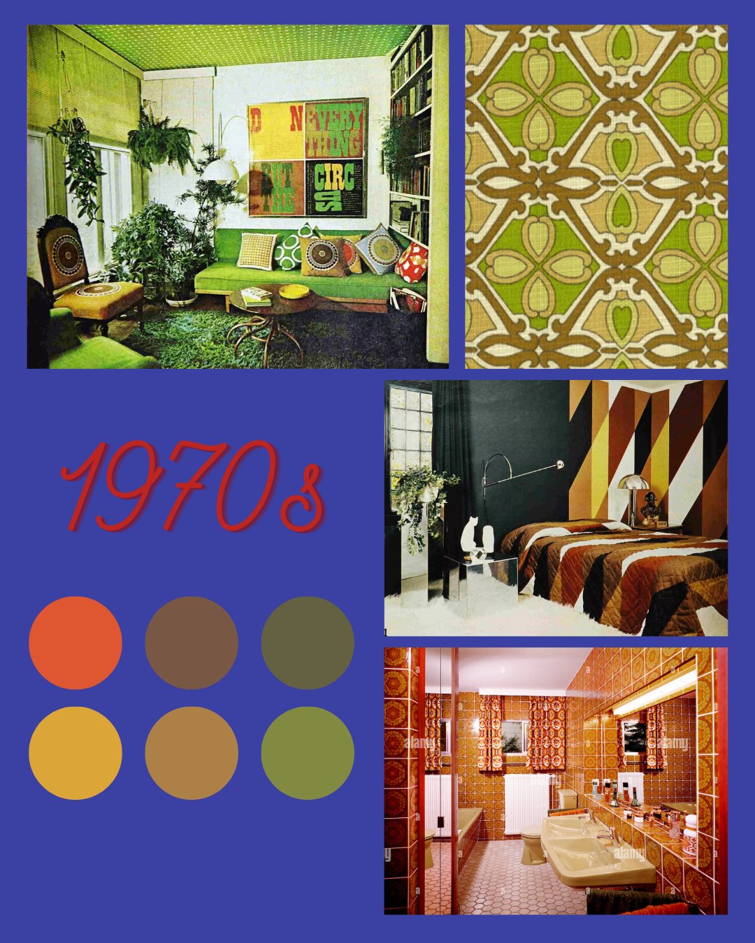
1970s
The 70s adopted an earthier palette of rich greens, and warm reds, browns and ochres, paired with natural materials such as stone worktops, wooden panelling and units. We saw styles from the past fused together and texture ramped up in the form of wicker furniture, woven textiles and shag carpets.... even in the bathroom! This era was all about self-expression and referred to as the “Me Decade” by novelist Tom Wolf. People wanted to express themselves creatively, so often ended up creating home made decorations such as macrame owls and wall hangings.
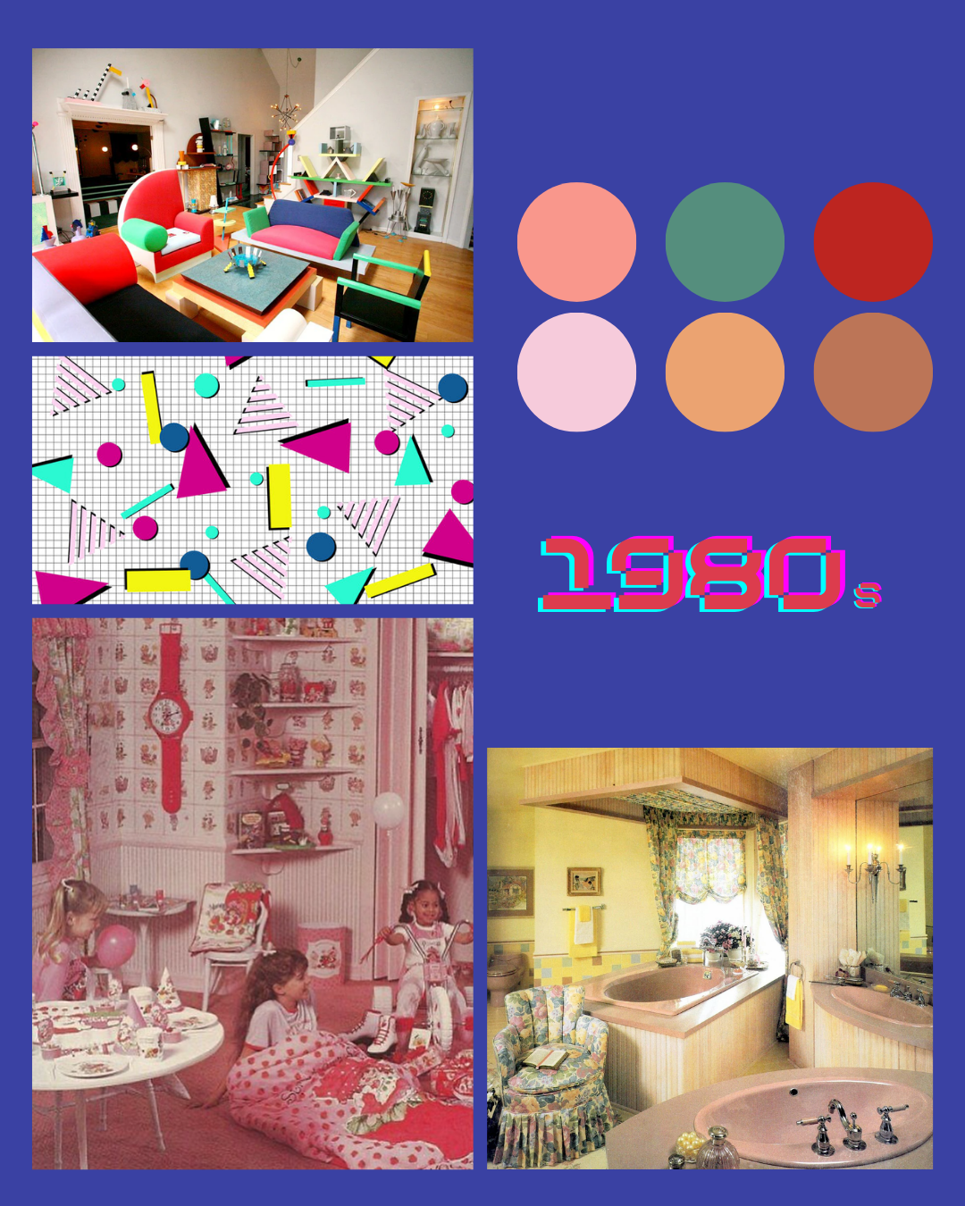
1980s
The 80s saw the colours ramped back up, with an emphasis on bold and bright hues and there were a variety of styles. Neon colours were signature to Memphis design, which embraced playful shapes and was often seen on bedding and art pieces, particularly in kids rooms. Pastels also made a comeback with peaches and blues and chintzy florals gained in popularity. Many homes also embraced bold primary colours such as red, yellow and blue. The 80s was a stark contrast to the natural colours and patterns of the 70s, but I’ve got a little soft spot for this experimental era.
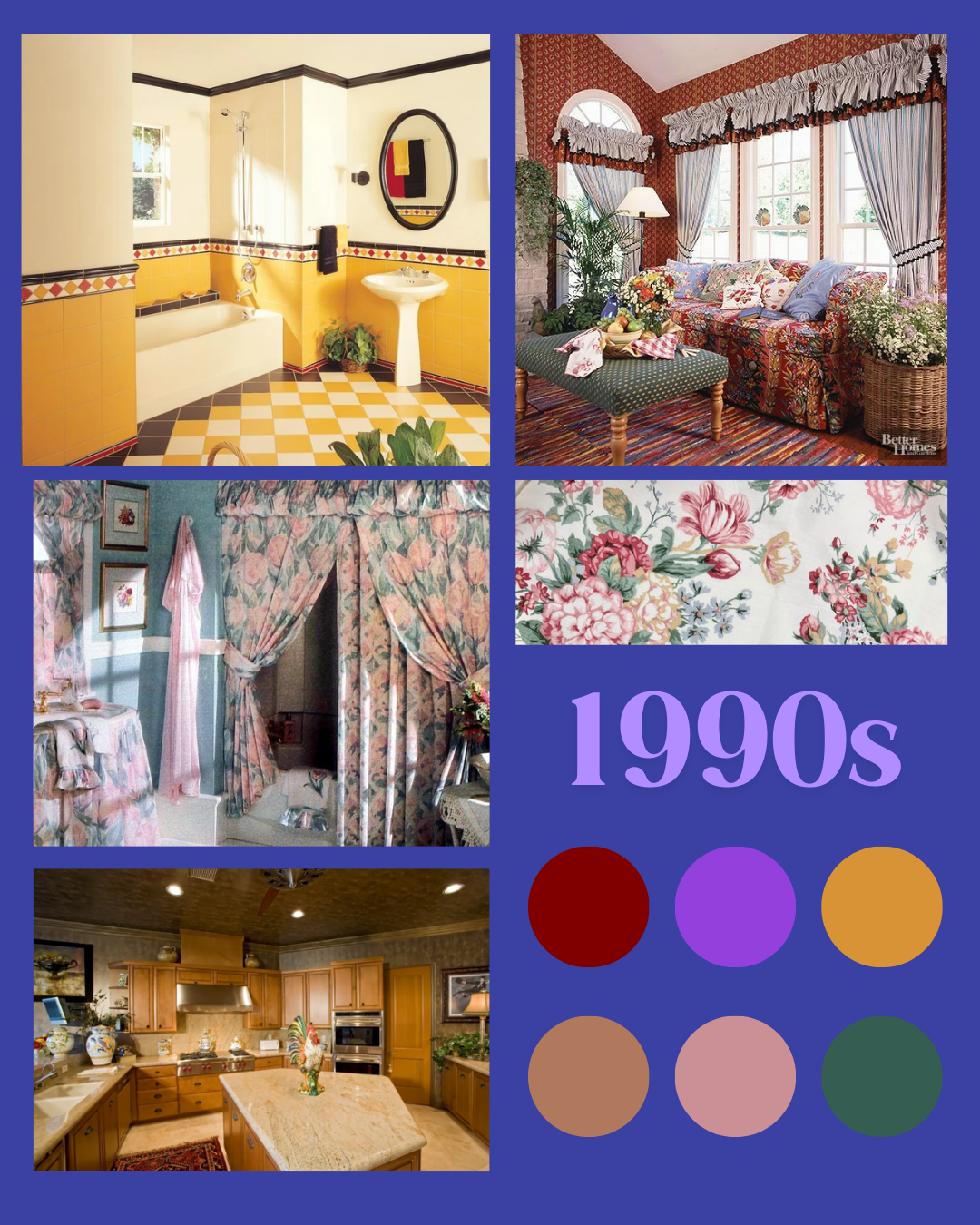
1990s
Pastel chintz and the bold, rustic farmhouse look still dominated the early 90s with gingham being the go to fabric. Pine and blonde wood filled our homes and chunky media units required their own extension. Interiors were heavily influenced by pop culture, with shows like ‘Changing Rooms’ turning everyone into sponge painting maniacs (I’m looking at you Linda Barker) and Monica’s iconic door, fuelling the demand for lilac paint. But with the first Ikea opening in the UK in 1987, we saw a shift towards a more subdued colour palette, with many turning their back on the bold colour combinations in favour of the calm and warmth of Scandi design. This era bridged the gap to the maximalism of the 80s and the pending minimalism of the 2000s. Damn you 90s!
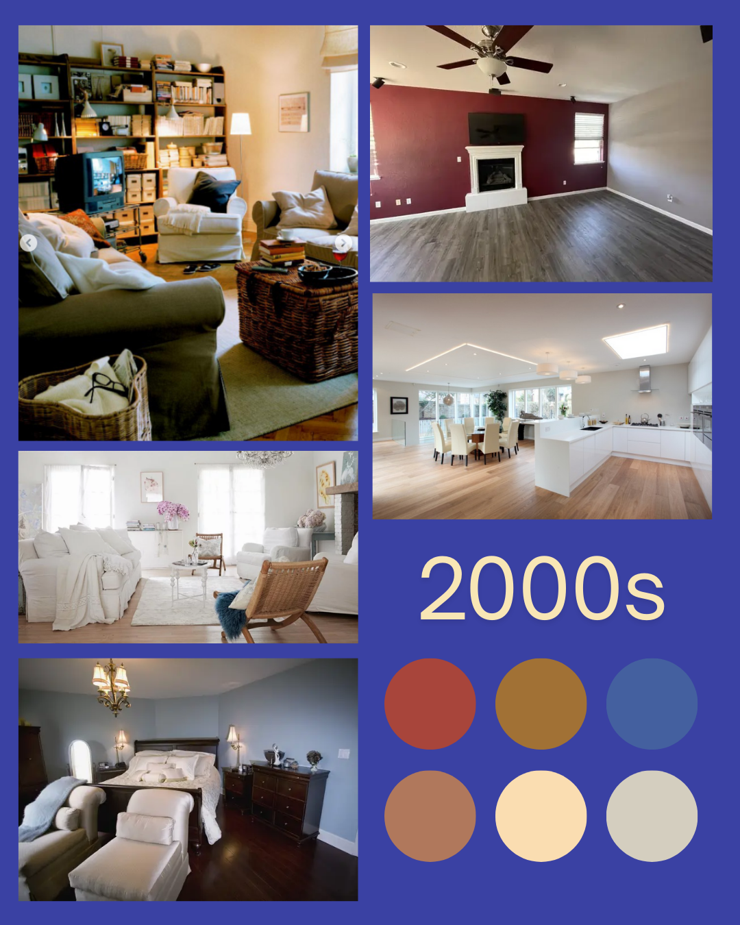
2000s
The colour party was ending. The early 2000s had Tuscan style kitchens, granite worktops and heavy wooden furniture, but walls throughout the rest of the house skewed to the safe side with beiges and magnolias. Those that were craving a bit of colour resorted to a solitary feature wall, but strictly in navy or red. And then came Farmhouses’ evil twin.... shabby chic! This trend saw everyone grabbing a tin of chalk paint to create the distressed look, and the leftovers tipped into a mason jar.
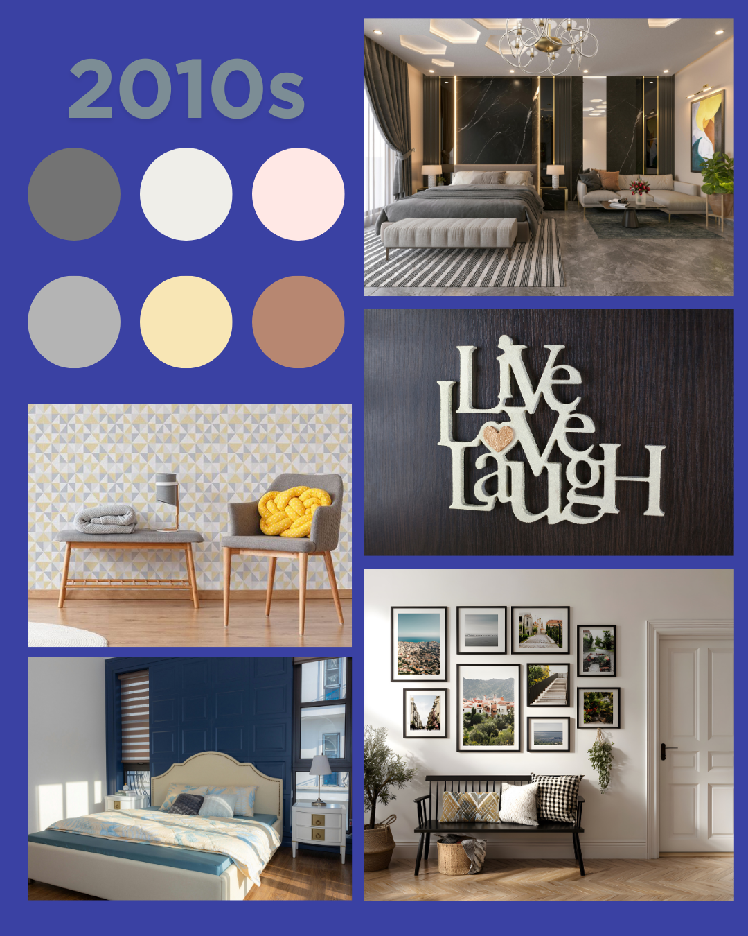
2010s
Shabby Chic had evolved into industrialism with exposed brick and raw metal finishes but Scandinavian hygge with it’s low lighting, simplicity and neutral palette’s ruled the roost. Décor was kept to a minimum and whichever style you learned towards, grey was the dominant colour. With both Instagram and Pinterest launching in 2010, interior design was re-shaped. Trends spread rapidly and altered the way we designed our homes and minimalism soared through these platforms. And with that, it killed creativity and individualism and the fear of colour was ingrained.
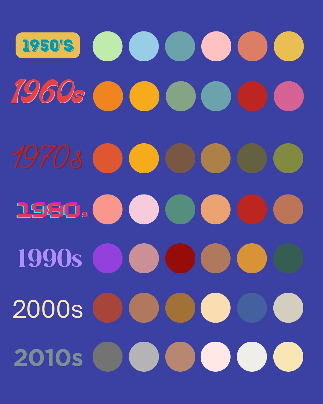
A visual breakdown of colour vanishing throughout the decades
But there is hope!
Colourful interior designers such as Sophie Robinson have been banging the colour drum for over 20 years and I’ve certainly seen a rise in colour lovers in both my feed and interior groups this last few years. I also noticed that during the pandemic many started looking for more vibrant colours to lift their spaces and their mood. Good.
So what’s stopping you?
There could be a very valid reason that you don’t like using colour in your home. Perhaps you suffer with Chromophobia (a fear of colour) or you adore neutral interiors. If that’s the case, there is no judgement here.
However, if you love colour but there is something stopping you using it, lets sort that out.
During my projects, I hear the same worries time and time again. My job is to re-assure and build confidence to embrace colour and pattern. So let me give you a few scenarios and see if we can quash those worries;
What if I make a mistake?
I meet people all the time that are worried about picking clashing colours or choosing something that will go out of style or even breaking design “rules”. Maybe you’re not afraid of colour, but very afraid of using the wrong colour. Designing for yourself rather than external validation creates a home reflects you, your tastes, your comforts and the colours that bring you joy. So my advice is to trust your instinct and go for it.
I don’t know where to start
If your natural instinct has been deeply buried, start small. A popular trick in interior design is to look in your wardrobe. Do you see lots of neutrals or is there a colour and pattern that pops out? What you feel good in to wear, is an indicator in what colours in your home will make you feel good too. Then start by incorporating colour in just one room and not making it permanent. This could be a piece of artwork, a cushion or even a lampshade. See how it makes you feel, and build on it from there.
Will using colour affect the re-sale value of my house?
If you are moving house within the next year, that is a very valid question. If you’re not, then this is a bonkers way to think. Surrounding yourself with colours that reflect you has the power to nurture you and your wellbeing. Explore what colours soothe you, uplift you, energise you or just simply make you smile.
What if I change my mind?
This is one of the biggest stumbling blocks that holds people back. But try not to worry: Design is not permanent, and that's the beauty of it. Homes are a evolving masterpiece where things can be swapped out, but I always advise that people test the paint swatches, wallpapers and fabrics in the space first to ensure you’re happy with how it interacts with your surroundings. And the chances are that if you’re trusting your instincts and designing for you, you are less likely to tire or change your mind.
Every project I’ve worked on to date, has been for a colour lover that’s nervous to use it but determined not to let the fear hold them back. With some gentle encouragement, they’ve embraced the colour and pattern and transformed their homes into a space that both reflects them and brings them joy.
IMAGE CREDITS -
1950s
https://clickamericana.com/topics/home-garden/colorful-vintage-1950s-home-decor
https://www.bhg.com/decorating/lessons/expert-advice/100-years-interior-design/
https://www.vintageinn.ca/tag/1950s-2/page/3/
1960s
https://retrorenovation.com/2016/02/19/palm-springs-time-capsule-home-in-technicolor/
canva.com
https://midcenturyliving.blogspot.com/2010/02/bathrooms-1960-65.html
https://www.love-rugs.com/blogs/style-guide/1960s-interior-design-tips
https://clickamericana.com/eras/1960s/mid-century-modern-living-room
1970s
https://www.loveproperty.com/galleries/90508/these-retro-living-rooms-are-a-vintage-lovers-dream?page=1
https://yellowdoguk.co.uk/?y=446104516
https://thunderdungeon.com/2025/07/27/38-retro-interior-design-photos-you-wont-believe-existed/
https://www.loveproperty.com/galleryextended/431395/homewares-we-loved-in-the-70s-you-dont-get-anymore?page=1
1980s
https://fannyandjune.com/blogs/blog/memphis-design-in-fashion
https://www.freepik.com/premium-photo/classic-s-s-retro-graphic-pattern-background_23936262.htm
https://www.instagram.com/p/C7_gP4AuCvu/
https://uk.pinterest.com/pin/909234612243072076/
1990s
https://www.familyhandyman.com/list/30-home-trends-kids-of-the-90s-remember/
https://www.bhg.com/decorating/lessons/basics/90s-decor/
https://clickamericana.com/topics/home-garden/1990s-bathroom-decor-accessories
2000s
https://www.instagram.com/p/DJ_RQuLRbyW/
https://www.reddit.com/r/interiordecorating/comments/13n1bky/paint_color_ideas_for_living_room_accent_wall/
https://www.total-bathroomsandkitchens.co.uk/
https://www.countryliving.com/home-design/decorating-ideas/g4732/shabby-chic-living-rooms/
https://www.buzzfeed.com/mollycapobianco/y2k-design-trends
2010s,
https://www.pexels.com/photo/interior-of-a-modern-hotel-bedroom-18368842/
https://www.goodhomesmagazine.com/inspiration/interior-trends-last-decade/
https://www.istockphoto.com/photos/live-laugh-love-sign
https://www.canva.com/p/shahsoft/